
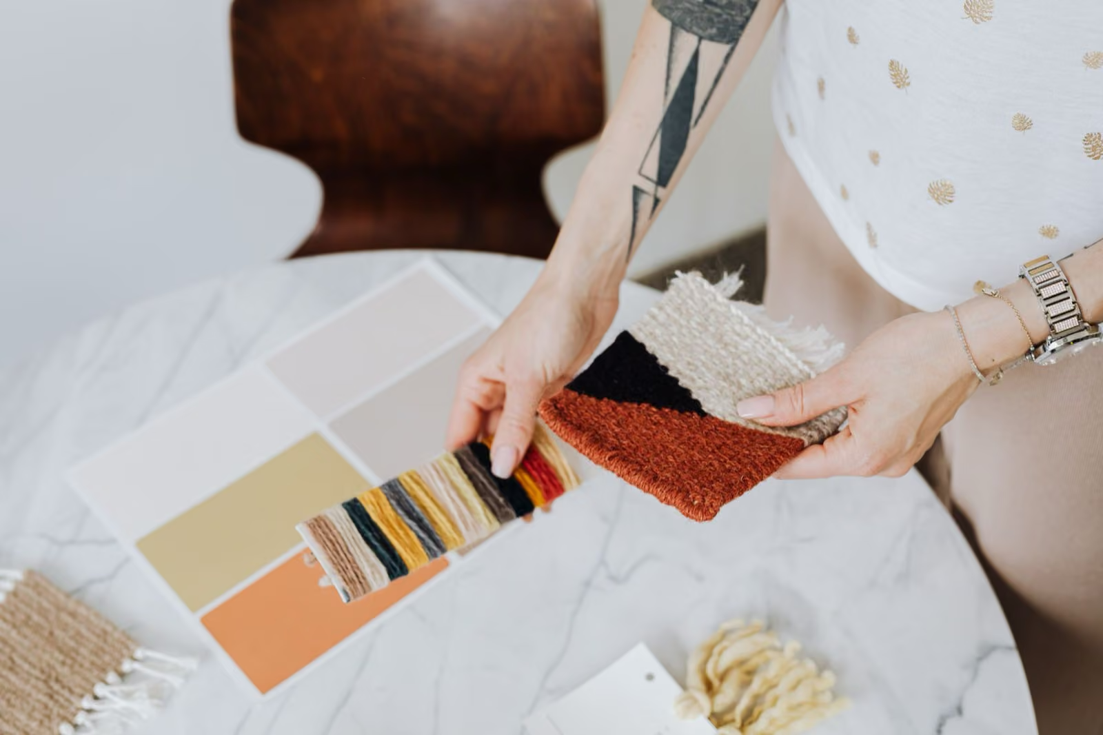
Do colors make you feel a certain way or bring back specific memories for some inexplicable reason? Does seeing red provide a feeling of alertness as seeing blue eases your stress and anxiety?
Colors not only attract and stimulate the senses but they’ve also been playing a major role in creating alluring marketing campaigns for a very long time.
Skilled Marketers and Graphic Designers alike have mastered the art of successfully implementing colors to influence potential customers by becoming experts on the psychology of color in advertising.
Marketing is often referred to as an art form, which it truthfully is. Having the ability to take a blank slate (browsing shopper) and turn it into a masterpiece (loyal customer) is indeed a talent.
Understanding when and how to utilize colors to subconsciously alter a person’s mood is a technique that, when used correctly, can turn masses to buyers with ease. Gifted Marketing Agencies, such as Pacific 54, know this firsthand as they’ve been harnessing this craftsmanship for years.
It is pivotal for marketers to consider the psychology of color in advertising as “research shows that the proper use of color increases brand recognition by 80%. It also raises the visual appearance by 93%.
A further 85% of consumers buy because of color” says Color Psychology.
Here is a list of 5 colors and descriptions as to why they increase sales and how they stimulate emotion.
-
RED
-
- The color Red is most directly linked with the sense of urgency and power. It stands out, it’s bold, and most importantly, it grasps the viewer’s attention. That’s why Red often coincides with sales & promotions. Red symbolizes passion, it evokes energy and increases the heart rate.
-
Blue
-
- The preferred color for men, Blue is used to capture the feeling of calmness and tranquility. It creates a feeling of trust and security for shoppers. As opposed to red, blue calms people down and eases anxiety. It is associated with companies that need to exude confidence and reliance.
-
Green
-
- Affiliated with nature, peacefulness, and growth, Green is often used when companies want to emit a welcoming warm feeling. When used in stores, it used to attract kind friendly customers.
-
Yellow
-
- Yellow is a double-edged sword. If used in the right balance, yellow can create a feeling of cheerfulness. If used too much, it creates sensations of anxiety and uneasiness. Used to direct the viewer’s attention and primarily to attract impulse buyers & window shoppers
-
Black
-
- Black has a wide range of versatility. It can be used to set a modern exciting tone or be applied for a more classic even-tempered setting. It provokes a feeling of luxury and class. It’s intimidating. It dominates the high-end market with subtle yet significant clues. When used properly, black can be extremely efficient.