Make the new brand feel real
Carry Banesco USA’s refreshed identity through every page, component, form, and interaction.

The outcome
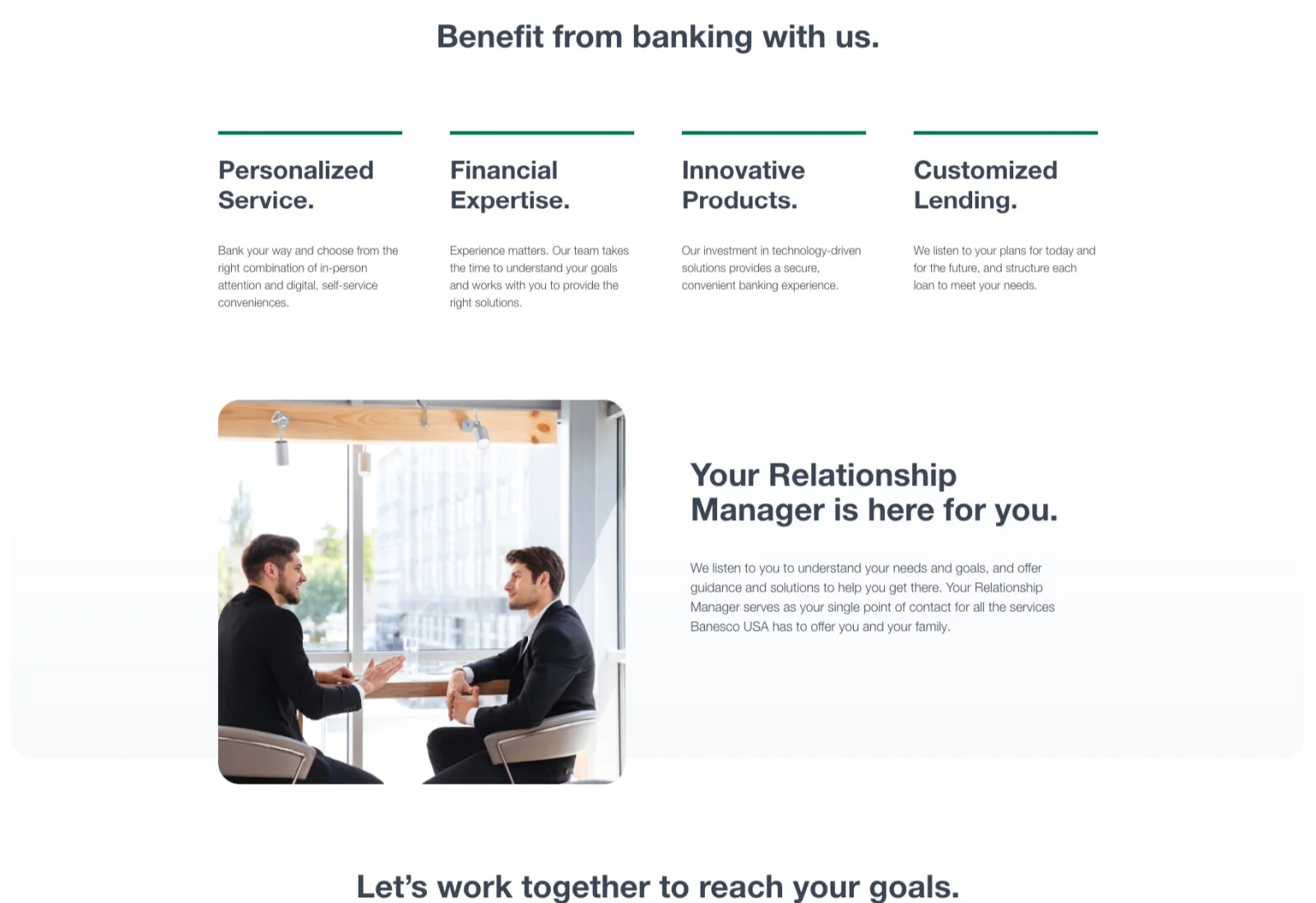
Pacific54 rebuilt Banesco USA’s website around clearer journeys, a reusable design system, and a mobile-first account-opening experience.
Your bank next
Same team, same process, your customers.
Start the workThe brief
Banesco USA serves businesses and families across South Florida. After a major identity refresh, its website still reflected the previous era: slow on phones, organized around internal departments, and difficult to use for everyday banking tasks.
The assignment was not simply to “modernize” the interface. The new site had to help more people find information, compare products, and complete an account application.
Carry Banesco USA’s refreshed identity through every page, component, form, and interaction.
Replace department-led navigation with the tasks people actually came to complete.
Reduce friction in account opening and improve speed on everyday phones and connections.
What changed
Website analytics, customer feedback, banking benchmarks, and journey tests led to three practical changes.
Decision 01
Analytics and customer feedback pointed to four recurring jobs: check rates, find a branch, reach support, and open an account. Those jobs became the backbone of the navigation and page hierarchy.
The customer’s language became the site structure.Customers had to translate their goal into the bank’s internal structure.
The most common tasks became visible paths from the first screen.
Decision 02
Instead of designing isolated pages, we defined typography, color, cards, forms, comparison tables, and calls to action as reusable components. Marketing could create new pages without redesigning the experience each time.
Consistency became part of the build, not a manual check.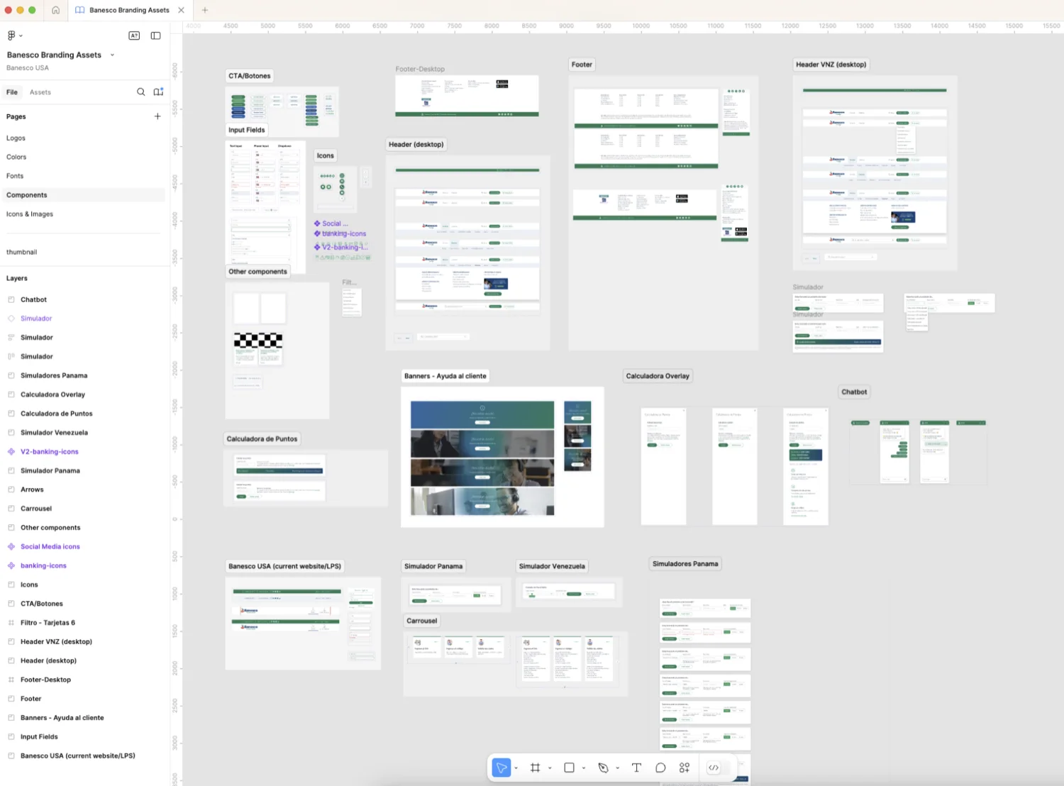
Decision 03
The mobile experience was treated as the main experience. Menus became task-focused, enrollment forms lost unnecessary fields, and page weight was reduced for mid-range phones and branch Wi-Fi.
The most common device received the least-compromised experience.
From system to screen
The system covered the practical details customers interact with every day, including product comparisons, application forms, contact modules, and campaign pages.

Performance after launch
Growth in completed online account sign-ups after launch
Fewer visitors leaving without taking an action
Longer visits as customers found what they came for
Customer signal after launch
Post-launch surveys added a human signal to the behavioral data and showed that the improvement was felt most clearly on mobile.

The takeaway
Customers can understand their options and begin a banking relationship at any hour, on any device, without the interface getting in the way.
Talk about your website