Make campus life visible
Replace a static institutional impression with the energy students and families experience on campus.

The outcome
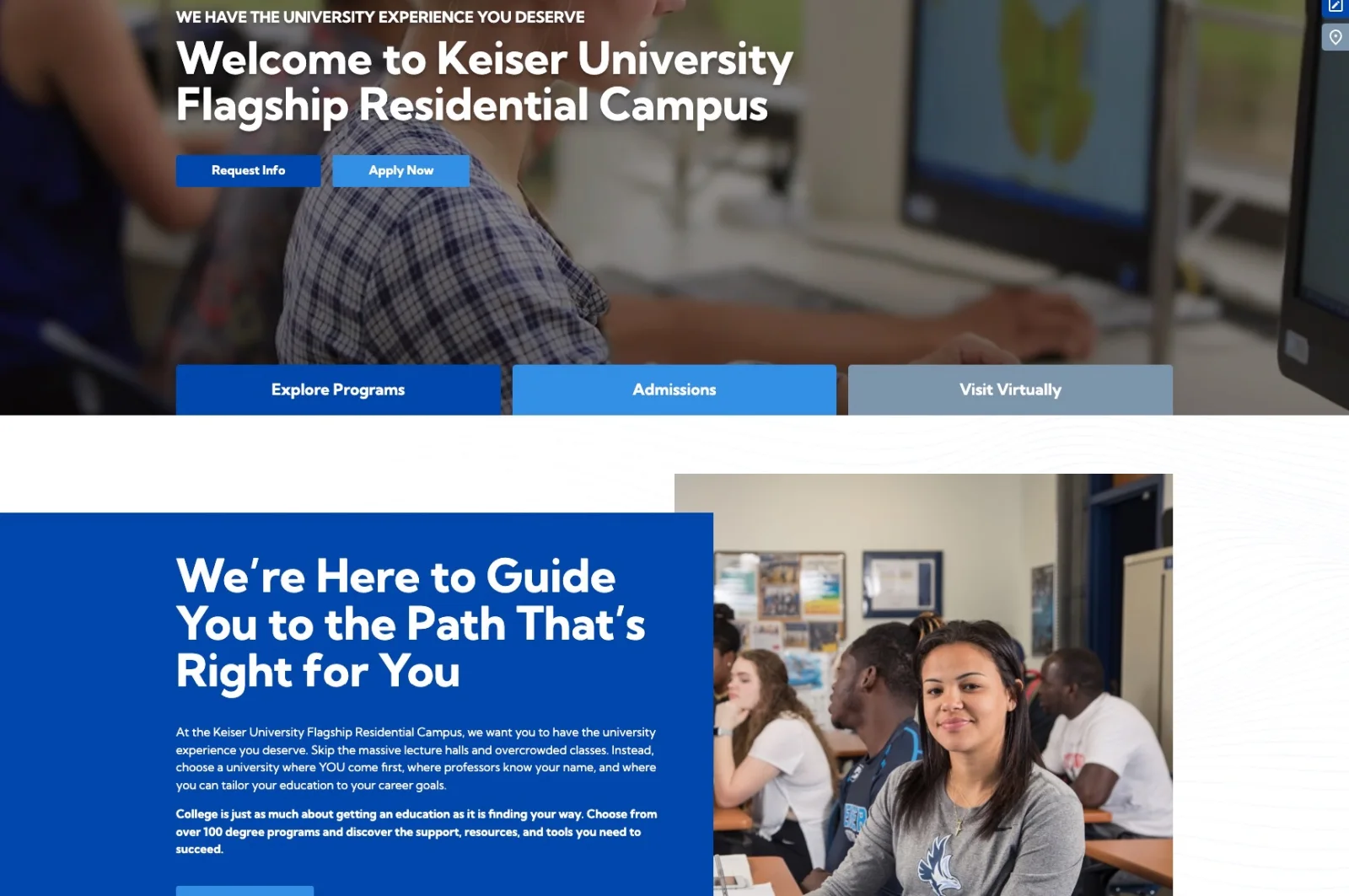
Pacific54 rebuilt the Flagship campus website around clearer program discovery, a stronger sense of campus life, and a mobile experience made for prospective students.
Your campus next
Same team, same process, your programs.
Start the workThe brief
Keiser University’s Flagship residential campus competes for students who often form their first impression on a screen. Life at the Flagship campus is active and social. Students have a 100-acre campus just minutes from the beach, with athletics, clubs, and events all year. The redesign set out to make that life visible from the first screen.
The redesign needed to help students understand their options, see what campus life felt like, and move confidently toward requesting information or applying.
Replace a static institutional impression with the energy students and families experience on campus.
Give programs, admissions, financial aid, and campus life a hierarchy visitors can understand quickly.
Make program exploration and application entry points work naturally on the devices students use most.
What changed
Research and student feedback focused the rebuild on journey planning, a scalable design system, and mobile discovery.
Journey mapping
User feedback helped identify the journeys that mattered most: explore programs, understand campus life, request information, and apply. We mapped those paths before designing the interface.
Every important journey received a visible next step.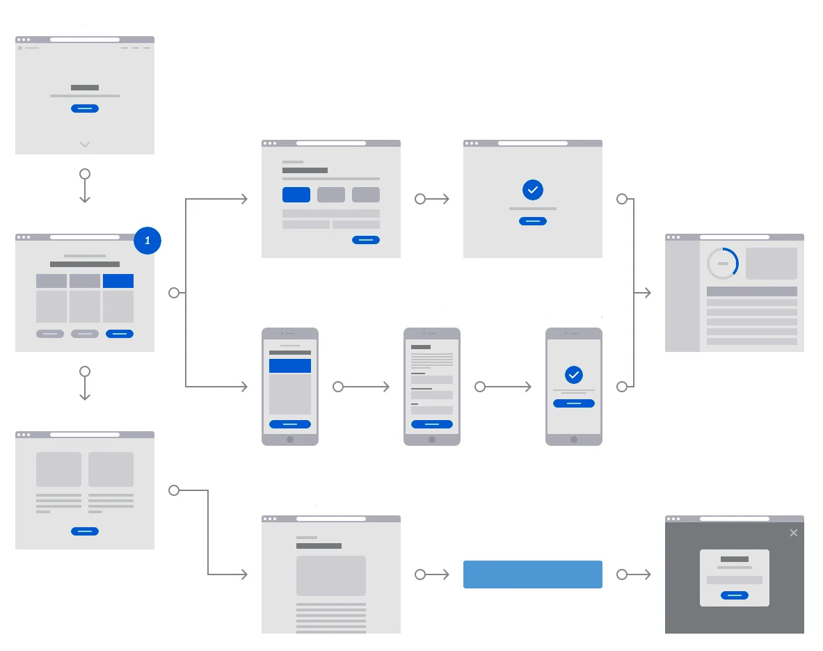
Design system
Program cards, news modules, filters, buttons, and request information blocks became reusable components. The system gave every program a consistent experience and made accessibility part of the component design.
Consistency became easier to maintain as the site grew.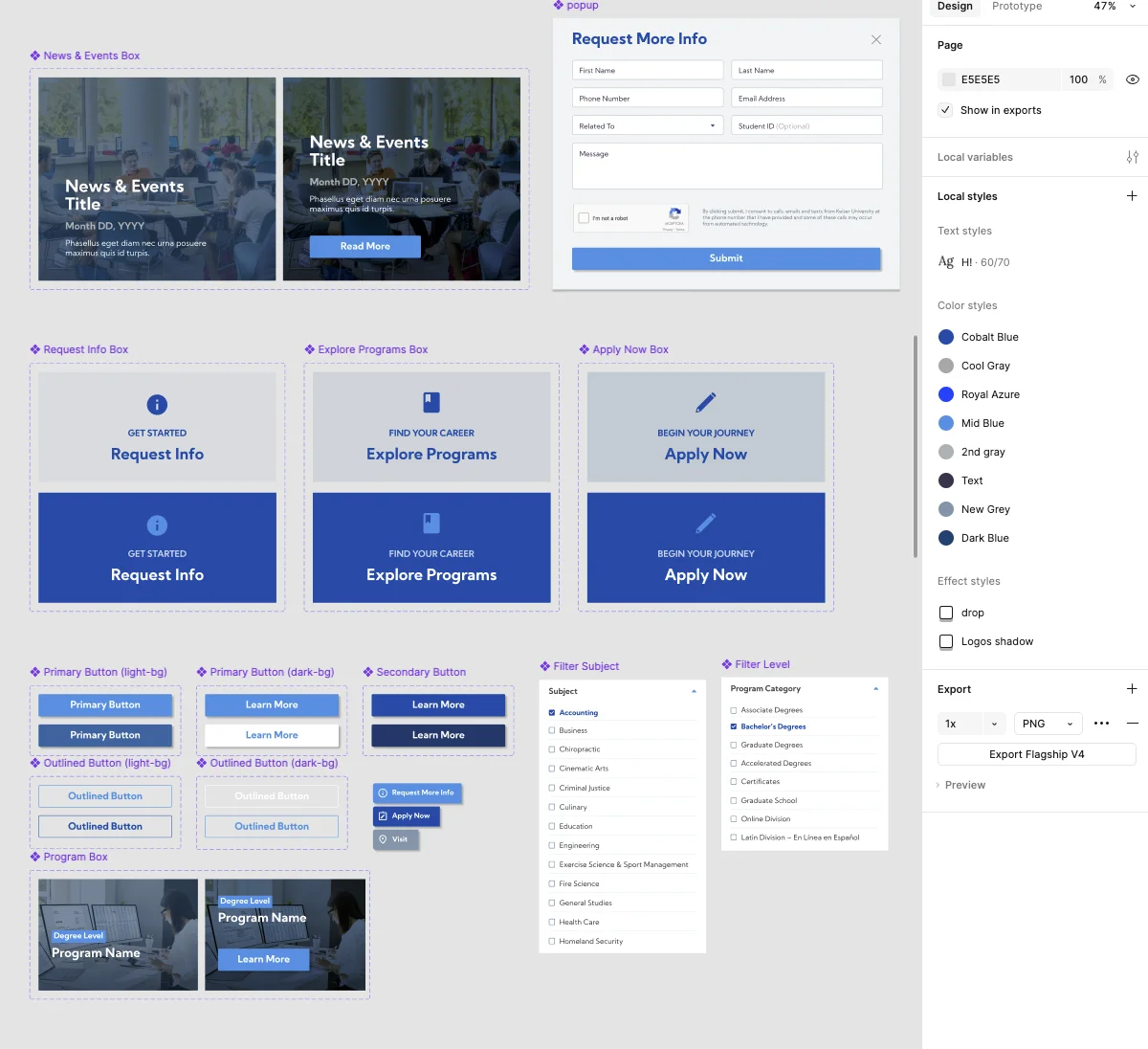
Mobile discovery
Program exploration, filtering, and application entry points were designed for phones first. Testing focused on navigation ease, visual appeal, accessibility, and mobile performance before launch.
The smallest screen received the clearest path forward.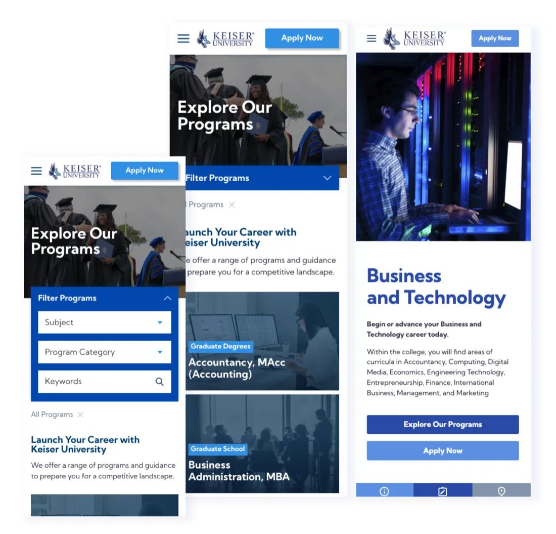
Performance after launch
Fewer visitors leaving after one page, driven by clearer hierarchy
Prospective students exploring what campus is actually like
Satisfaction scores from post-launch user research on mobile
The takeaway
Prospective students now meet the Flagship campus the way it deserves to be met: clear programs, visible campus life, and an easy next step on any device.
Talk about your university website