Implement These UX Design Best Practices to Reduce Bounce Rate Today

UX design best practices are more than clean interfaces and intuitive layouts; they’re the invisible architecture behind higher engagement, more substantial conversions, and lower bounce rates. At Pacific54, we believe user experience isn’t a finishing touch; it’s the foundation of any successful digital strategy.
If users land on your site and leave without clicking, scrolling, or converting, your design fails them. In this article, we’ll break down strategic, research-driven UX principles you can implement today to create frictionless user journeys and keep visitors exactly where you want them: engaged and ready to take action.
Ready to reduce bounce rate and build smarter UX? Start a conversation with our team today.
Table of Contents
- What Is UX and What Makes a Good UX Strategy?
- Design for Clarity: Guide Users with Clear Visual Hierarchy
- Eliminate Friction: Simplify Forms and Reduce User Effort
- Make Content Scannable: Use Layout to Match How Users Read
- Build Trust Instantly: Use Design Signals That Instill Confidence
- Turn UX Best Practices Into Measurable Results
What Is UX and What Makes a Good UX Strategy?
User experience (UX) is how real users feel when interacting with a digital product, whether browsing, buying, reading, or navigating.
It blends functionality with emotion, shaping whether users stay, convert, or bounce. Every interaction, from layout to load time, plays a role in that outcome. Effective UX aligns business goals with human behavior. Each element on the screen should serve a clear, usable purpose that supports a seamless journey.
A good UX strategy begins with user data and ends with clarity. It emphasizes user satisfaction, removes unnecessary friction, and favors simple interfaces that work across mobile devices.
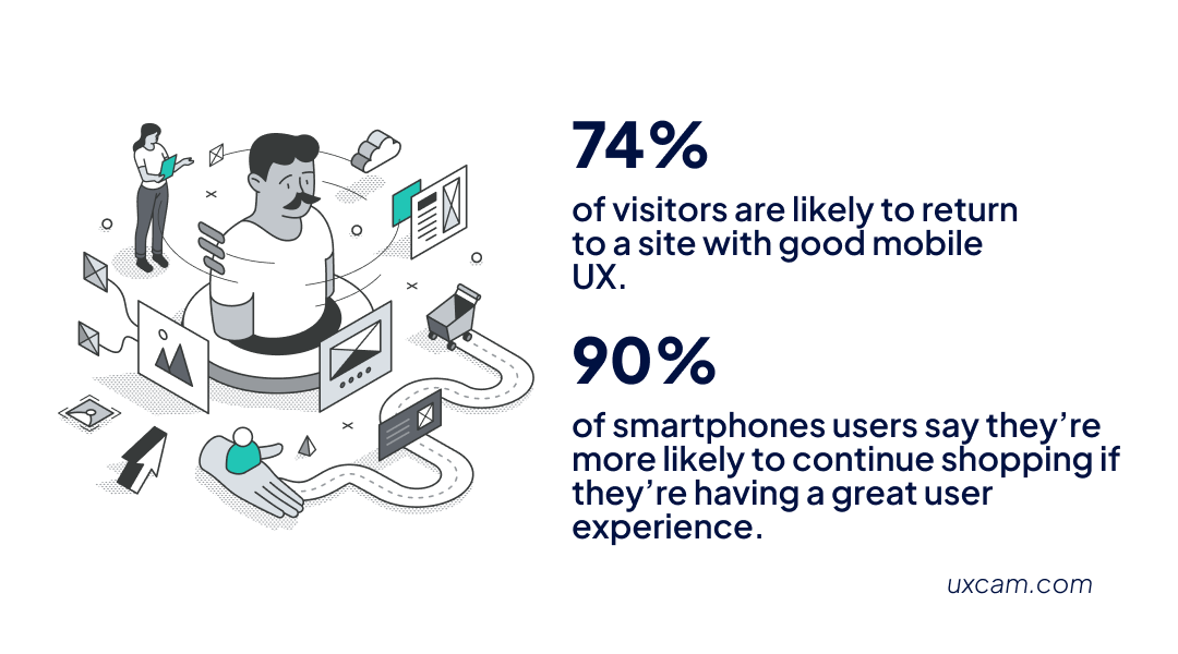
Consider this: 74% of visitors are likely to return to a site with good mobile UX, and 90% of smartphone users say they’re more likely to continue shopping if they're having a great user experience (UXCam).
UX strategy isn’t visual polish. It’s a commitment to reducing effort and increasing value, from the first click to the final conversion.
Prioritize Speed: Optimize Page Load Times to Prevent Early Exits
Before users can engage with a digital product, they need to access it, and slow load times create instant drop-off.
Performance is the first UX signal a visitor receives. If a page takes more than a couple of seconds to load, users leave. According to Shopify, the bounce rate increases by 32% when page load time rises from 1 to 3 seconds.
Speed optimization should be built into the design process, not added after launch. Faster load times reduce friction, improve usability, and directly support conversion and engagement.
Streamline backend requests, compress large image files, and reduce heavy scripts to ensure performance across all devices.
Design for Clarity: Guide Users with Clear Visual Hierarchy
Good UX doesn’t overwhelm; it orients. Clear visual hierarchy helps users scan, decide, and act. When every element competes for attention, clarity suffers. Instead, users need structure that feels effortless, layouts that breathe, and sizing that creates momentum through a page. Here’s how to break it down:
Intuitive Structure Helps Users Navigate Without Thinking
A strong, intuitive structure removes confusion and supports faster decision-making. Visitors should immediately recognize what the page is about and where to go, without having to read every word.
To support intuitive navigation, apply these structural best practices:
- Predictable menu placement (top, sticky, or side nav) to reduce hunting
- Logical flow from headlines to supporting content for faster comprehension
- Visible search bars that offer quick access to key destinations
- Clear page sections with consistent headers and layout patterns
Clear Layouts Make Every Interaction Feel Effortless
Whitespace, alignment, and grouping aren’t cosmetic; they shape how people interpret content. A clean layout draws attention to what matters most and reduces decision fatigue. By consistently applying grid systems and visual spacing, you help users focus on the task at hand. Conduct usability tests to spot distractions and fine-tune visual elements that feel cluttered or confusing.
71% of consumers expect brands to provide personalized experiences (McKinsey), and that begins with layouts that serve the user’s context and intent.
Sizing and Obvious Paths Drive User Action
Hierarchy isn’t just about where things are placed; it’s also about proportion.
Larger fonts, buttons, and visuals communicate importance and help users understand what to do next. Users instinctively recognize where to click and what matters most when elements are sized with intent.
Primary calls to action should stand out clearly without overwhelming the surrounding content. Consistent sizing patterns create visual rhythm, guiding users through the page easily.
Clear, apparent paths reduce hesitation and improve both discoverability and user flow.
Keep Navigation Intuitive: Make Movement Effortless Across Pages
Navigation drives how users move, not just through your site, but through decisions. They'll bounce if that movement feels clunky, confusing, or inconsistent.
Intuitive navigation lowers cognitive load, builds confidence, and allows the interface to disappear so users can focus on content and actions. It’s not just about menus; it’s about applying key principles that make interaction feel seamless across all devices.
88% of users state they will abandon an app if it consistently experiences glitches or technical bugs (Shake Bugs). The same holds true for websites: broken, laggy, or inconsistent navigation quickly erodes trust.
Website Support Should Reinforce Navigation, Not Replace It
Website support tools like live chat, help centers, and search bars should enhance navigation, not cover up poor design.
- Users should never need support to find basic information
- Key support elements, like sticky headers or footer quick-links, should be integrated where they’re most helpful
- When required, support must be fast, contextual, and accessible across all screen sizes
Use Progressive Disclosure to Keep Interfaces Clean
Good navigation uses progressive disclosure to show only what’s necessary and when needed.
- Reveal essential actions or options first
- Hide complex features until deeper interaction is initiated
- Use expandable menus, tabbed content, and modal windows to control information flow
This technique reduces distractions, respects user attention, and improves mobile usability.
Color Schemes and Visual Cues Should Guide Movement
Color schemes play a functional role in navigation. When used consistently, they guide users without saying a word.
- Apply distinct colors for hover, active, and disabled states
- Use contrast to highlight clickable visual elements
- Avoid using color alone to convey meaning, and ensure accessibility for all users
With layout and sizing, color becomes a navigational tool that builds momentum and user confidence.
Eliminate Friction: Simplify Forms and Reduce User Effort
Forms are where intent becomes action, but also where bounce rates surge. Whether users sign up, check out, or request a demo, poor form design creates immediate drop-off.
If your form doesn’t adapt across screen sizes or demands more effort than expected, it’s quietly killing conversions.
Streamline Forms to Boost User Experience
Effective form UX begins with clarity and reduction. Every additional field adds friction, especially on mobile. To simplify the experience:
- Group related fields to reduce cognitive load
- Limit the total field count to essential information
- Use tap targets, autocomplete, and mobile-friendly input formats
- Run usability tests across devices, including your mobile app
The outcome? A smoother flow that creates a positive user experience and increases completion rates.
Lead-Gen Profits Start with Frictionless UX
Smart form design fuels better lead generation. Shorter, adaptive forms remove hesitation and build trust from the first click. Progressive profiling gradually collects data, and smart defaults minimize effort. Removing friction directly boosts lead quality and conversion performance, especially on mobile, where attention spans are shortest.
Design for Mobile, Validate with User Feedback
Desktop-optimized forms often break down on mobile. To ensure responsive performance and user-friendly behavior across all screen sizes:
- Avoid horizontal scrolling and cluttered layouts
- Prioritize large input fields and simple dropdowns
- Design with thumb zones and minimal keystrokes in mind
- Gather real-time user feedback through heatmaps, session recordings, and exit surveys
Data-driven adjustments remove blind spots and create forms that convert users everywhere they engage.
Make Content Scannable: Use Layout to Match How Users Read
Most users scan content rather than read it in full. If key information isn’t instantly visible, they leave. A clean layout improves readability and creates a pleasant user experience across all devices.
Keep content tight and easy to process. Break long paragraphs, use consistent formatting, and ensure readability for mobile users, screen readers, and people with disabilities.
To improve scannability:
Use headings, subheadings, and bullets: Structure information clearly for users.
Highlight key terms and CTAs: Helps users instantly spot what matters.
Remove unnecessary elements: Make sure nothing distracts from the core message.
Build Trust Instantly: Use Design Signals That Instill Confidence
Trust is built in seconds. Users won't stick around if your site feels unprofessional or unsafe, let alone convert. Trust signals reduce cognitive load and create immediate comfort for new visitors.
Two essential elements drive trust on first impression: SSL security and social proof.
SSL Builds a Baseline of Security
Users expect protection. A valid SSL certificate is non-negotiable. It ensures data safety, shows the browser lock icon, and signals legitimacy, especially for e-commerce or lead-gen sites. Without it, bounce rates spike.
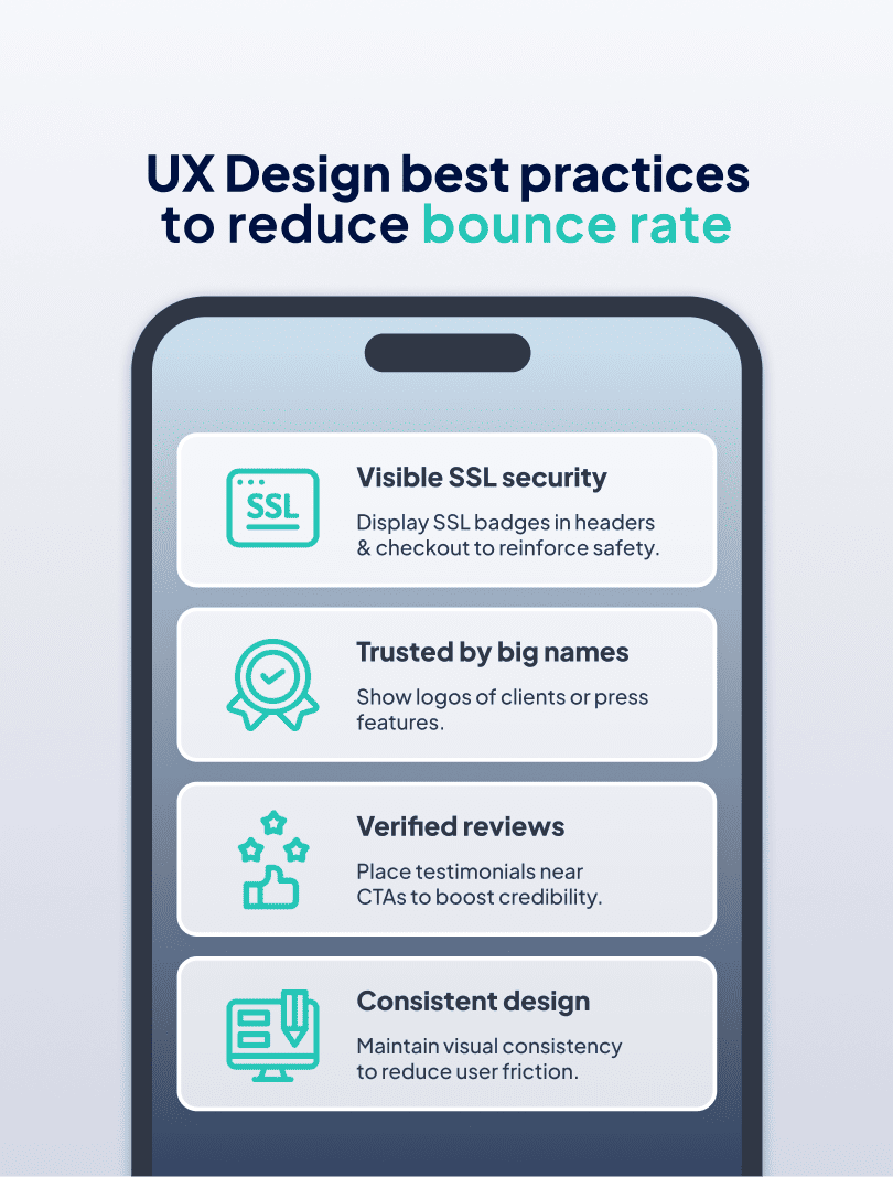
Social Proof Creates Confidence Through Others
Customer testimonials, review ratings, and trust badges make a site feel established and credible. Social proof reinforces your competitive advantage by showing others trust you, too.
To maximize trust-building:
- Display SSL security and privacy info in visible areas (e.g., headers, checkout)
- Add verified reviews or testimonials near CTAs
- Use logos of well-known clients or media mentions
- Maintain a consistent design that aligns with user expectations
Turn UX Best Practices Into Measurable Results
Alt text: ux design process best practices
Bounce rate isn’t just a number; it signals that your user experience needs work. Applying these UX design best practices, from improving speed and structure to simplifying forms and reinforcing trust, you position your digital product to engage, convert, and retain real users.
Good UX aligns with your business goals, supports mobile behavior, and removes the friction that keeps visitors from taking action. It’s not about adding more; it's about refining what matters.
Need help turning your site into a high-converting experience? Contact Pacific54 to optimize your UX and drive better outcomes, faster.